Infinity Scenography
An analysis of the Louis Vuitton campaign with the Japanese artist Yayoi Kusama
Art and fashion have a long history of exciting partnerships. The second collaboration between Yayoi Kusama, the renowned Japanese conceptual artist, and Louis Vuitton, one of the world's biggest fashion brands, proved to be one its greatest yet. The global campaign focused on the idea of "Creating Infinity", bringing to life the world of Kusama with the LV global experience.
In my opinion, the entire campaign went beyond expectations. Besides combining the iconic YK coloured dots with traditional LV prints, they created a series of immersive installations celebrating the collaboration, architectural interventions, scenography, digital media, projections and more.
There were 6 scenographic elements that really stood out as I reviewed the campaign:
Building facade interventions
Projections
Robotic installations
Sculptures
Material usage
Retail displays
Are you ready to get into the colorful world of Yayoi Kusama? 💁🏻♀️🎨 Let's go!
Building facade interventions
The massive integrations of the YK brand into the LV building structures was of epic proportion.
This LV store in Paris was the most iconic of the campaign: a gigantic ballon across the top depicts Yayoi Kusama hand painting the building.
In this image you can see the cables that fix the balloon and also the metal structures that secured all the coloured dots onto the building facade.
2. Projections
A 3D digital billboard in Shinjuku Tokyo grabbed everyone's attention at one of the world's busiest intersections.
The coordinated effort of similar images on billboards across Tokyo was a bold and graphic approach that stood out, no matter if you viewed it from the street or the windows of surrounding buildings.
3. Robotic installations
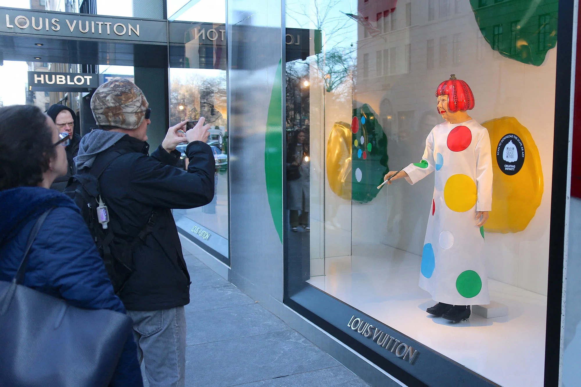
The retail window displays included robots of YK painting her famous dots on the windows. These were featured in the LV store on 5th avenue and created lines of people filming and photographing the scene - leading to spontaneous social media marketing.
4. Sculptures
Art and fashion merge as sculptural elements were seen across many in-store displays.
5. Material Usage
By using reflective materials on all of the base boards of the furniture installations (shelving, mannequin bases, reflective balls supporting tables) it continues the infinity illusion that extends the campaign concept. By covering every surface and overhwhelming your senses with the colored dots the visitor can connect to the manic sense of anxiety that has powered Yusama's work for decades.
6. Retail display
They also used the products as color dots, combining them in a way that integrates them into the Kusama painting.
In this image you can see how the black bag got mixed with the black dots creating a connection between the product and the scenography around it.
So, what you think about this campaign?
Does it make you want to purchase the products? Does it elevate the art of Kusama's dots? Have you ever saw any of her work? Let me know in the comments! :)


